Dominik Wujastyk
2017-06-18 00:09:31 UTC
I've done some more Devanagari font testing, and the results can be viewed
here
<Loading Image...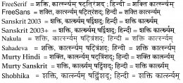 >.
>.
The TeX code that produced this is in my blog
<https://cikitsa.blogspot.ca/2017/06/expanded-devanagari-font-comparison.html>
.
Of the fonts tried out, only Sanskrit 2003, Murty Sanskrit, and Shobhika do
the right things with *á¹£aá¹triá¹Åad*.
Best,
Dominik
â
--
Professor Dominik Wujastyk <http://ualberta.academia.edu/DominikWujastyk>
â,â
Singhmar Chair in Classical Indian Society and Polity
â,â
Department of History and Classics <http://historyandclassics.ualberta.ca/>
â,â
University of Alberta, Canada
â.â
South Asia at the U of A:
âsas.ualberta.caâ
ââ
here
<Loading Image...
 >.
>.The TeX code that produced this is in my blog
<https://cikitsa.blogspot.ca/2017/06/expanded-devanagari-font-comparison.html>
.
Of the fonts tried out, only Sanskrit 2003, Murty Sanskrit, and Shobhika do
the right things with *á¹£aá¹triá¹Åad*.
Best,
Dominik
â
--
Professor Dominik Wujastyk <http://ualberta.academia.edu/DominikWujastyk>
â,â
Singhmar Chair in Classical Indian Society and Polity
â,â
Department of History and Classics <http://historyandclassics.ualberta.ca/>
â,â
University of Alberta, Canada
â.â
South Asia at the U of A:
âsas.ualberta.caâ
ââ
Dear Vikram,
Your plan to work on refining and expanding Sanskrit 2003 is excellent!
Since funding is needed, I recommend you consider a crowd-funding
initiative. That would fit the situation very well, allowing people to
contribute in a structured and transparent manner, and avoiding many legal
and financial problems.
Please, please give the font a new name, when your work is released. Even
if it's just Sanskrit 2003A.
About the design of Sanskrit 2003, I still like the font best, I think,
amongst the many Devanagaris available today. Murty Sanskrit is my second
choice, and I would add that Murty Sanskrit looks better on paper than on
the screen.
However, about Sanskrit 2003, I find it a little compressed,
horizontally. The document processing system I use, TeX, allows me to
tweak that as I wish, and I have found that expanding Sanskrit 2003 by 8%
horizontally gives a result that is more pleasing to my eye. It's a
personal thing, but perhaps worth thinking about.
Here are some samples <https://tinyurl.com/y96ufrog> of Sanskrit 2003
normal and stretched, with some other faces for comparison.
Best,
Dominik
â
--
Professor Dominik Wujastyk <http://ualberta.academia.edu/DominikWujastyk>
â,â
Singhmar Chair in Classical Indian Society and Polity
â,â
Department of History and Classics
<http://historyandclassics.ualberta.ca/>
â,â
University of Alberta, Canada
â.â
âsas.ualberta.caâ
ââ
On 15 June 2017 at 13:51, Madhav Deshpande via INDOLOGY <
Hello Vikram,
This is a wonderful news. Having done some font-designing myself, I
know how time-consuming and complicated this work is. I hope your effort
is successful and produces an improved version of Sanskrit 2003, with
light, bold and italic versions. Please keep us posted about availability
of these new versions. With best wishes,
Madhav Deshpande
Ann Arbor, Michigan, USA
INDOLOGY mailing list
committee)
http://listinfo.indology.info (where you can change your list options or
unsubscribe)
This is a wonderful news. Having done some font-designing myself, I
know how time-consuming and complicated this work is. I hope your effort
is successful and produces an improved version of Sanskrit 2003, with
light, bold and italic versions. Please keep us posted about availability
of these new versions. With best wishes,
Madhav Deshpande
Ann Arbor, Michigan, USA
Hi Everyone,
I am writing this as I am collaborating with a
typography expert to create a better version of Sanskrit 2003 free for all
with support for light weight and several ligature upgrades. As with any
activity of this scale funds are required to be able to keep the project
going. If anyone is willing to contribute financially please get in touch
with me.
A sample version of the upgraded font is attached
below.
<Loading Image...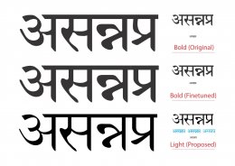 >
>
Groups "à€à€Ÿà€°à€€à¥à€¯à€µà€¿à€Šà¥à€µà€€à¥à€ªà€°à€¿à€·à€€à¥" group.
To unsubscribe from this group and stop receiving emails from it, send
For more options, visit https://groups.google.com/d/optout.
_______________________________________________I am writing this as I am collaborating with a
typography expert to create a better version of Sanskrit 2003 free for all
with support for light weight and several ligature upgrades. As with any
activity of this scale funds are required to be able to keep the project
going. If anyone is willing to contribute financially please get in touch
with me.
A sample version of the upgraded font is attached
below.
<Loading Image...
 >
>Dear Colleagues,
I have been using the Sanskrit 2003 unicode Devanagari font for
some time, and have noticed that for some characters, the anusvÄra almost
merges with characters like sign for short "i". Here are a few sample
[image: Inline image 1]
Am I alone in seeing these problems, or is this happening only on
Mac computers, and not on Windows? I have written to Omkarananda Ashram
about this and I am hoping to hear from them.
If someone has a solution to this font problem, I would appreciate
hearing it.
Madhav Deshpande
Ann Arbor, Michigan, USA
--
You received this message because you are subscribed to the GoogleI have been using the Sanskrit 2003 unicode Devanagari font for
some time, and have noticed that for some characters, the anusvÄra almost
merges with characters like sign for short "i". Here are a few sample
[image: Inline image 1]
Am I alone in seeing these problems, or is this happening only on
Mac computers, and not on Windows? I have written to Omkarananda Ashram
about this and I am hoping to hear from them.
If someone has a solution to this font problem, I would appreciate
hearing it.
Madhav Deshpande
Ann Arbor, Michigan, USA
--
Groups "à€à€Ÿà€°à€€à¥à€¯à€µà€¿à€Šà¥à€µà€€à¥à€ªà€°à€¿à€·à€€à¥" group.
To unsubscribe from this group and stop receiving emails from it, send
For more options, visit https://groups.google.com/d/optout.
INDOLOGY mailing list
committee)
http://listinfo.indology.info (where you can change your list options or
unsubscribe)